Build a Slide-In Mobile Menu in TanStack Start with Tailwind v4
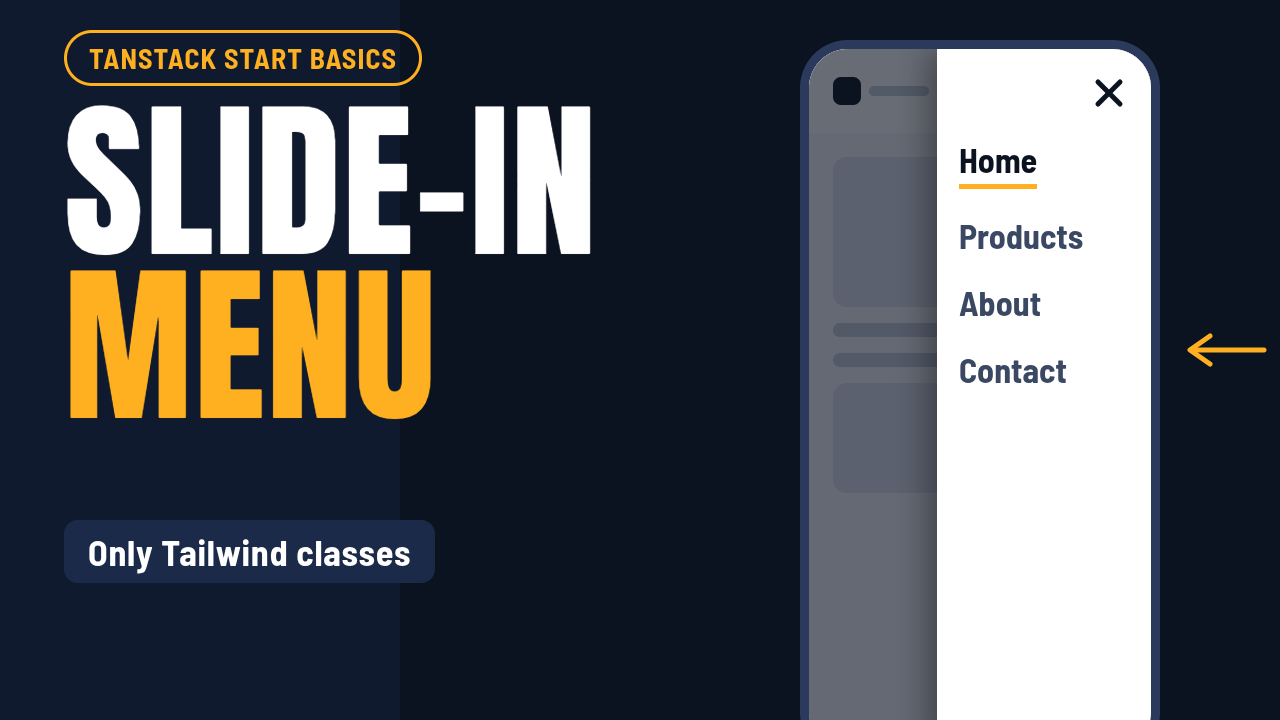
https://www.youtube.com/watch?v=4oE4P7uGF3Y A mobile menu that pops in and out works, but it feels unfinished. In this article we turn it into a drawer that slides in from the right with a fading bac
Responses
Markdown supported · ⌘↵ to post
Rishabh Mishra
Cloud FullStack Developer & Design Engineer.
Nice detail including prefers-reduced-motion. One more that bites on mobile: animate the panel with transform/translateX rather than width, and set aria-expanded on the toggle. The transform avoids layout thrash, and screen readers announce the menu state correctly.