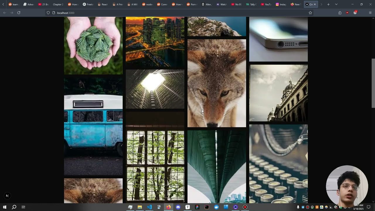
This is a clean reminder that columns-* gets you most of a masonry layout for almost no cost. The two details I would underline are break-inside: avoid on every card, including the inner section wrappers, and the reading order — down the first column, then across — which is fine for a gallery but worth flagging if the cards are meant to be read in sequence. I also appreciated the honest note about the ragged bottom edge: when the images have different aspect ratios, a small gap and a consistent card treatment hide it better than trying to force equal heights. Have you tested it much on mobile, where a single column makes the layout moot but the break-inside rule still matters?
Steven Mock
Founder of MockTools
This is a clean reminder that columns-* gets you most of a masonry layout for almost no cost. The two details I would underline are break-inside: avoid on every card, including the inner section wrappers, and the reading order — down the first column, then across — which is fine for a gallery but worth flagging if the cards are meant to be read in sequence. I also appreciated the honest note about the ragged bottom edge: when the images have different aspect ratios, a small gap and a consistent card treatment hide it better than trying to force equal heights. Have you tested it much on mobile, where a single column makes the layout moot but the break-inside rule still matters?